Six Colors
Six Colors

Apple, technology, and other stuff

Support this Site

Become a Six Colors member to read exclusive posts, get our weekly podcast, join our community, and more!

By Jason Snell

First look: macOS Sequoia Public Beta

macOS Sequoia, out in public beta now and due to be released this fall, is more of a work in progress than most macOS beta versions come July. Not to say that it’s a mess—it’s very much in the tradition of recent macOS releases, which have been fairly solid and lacking in drama—but that its most promoted feature, Apple Intelligence, isn’t ready for public view.

There are numerous other features that I’ve gotten the chance to try, and that anyone can now test drive over the summer if they desire a head start on future features.

Overall, this is a pretty light load of features for this time of year—entirely understandable, given that so many of the features announced in June are works in progress that are likely not to ship until late fall or even next year. Even some features promised for this fall aren’t visible yet. Still, there are some handy features that are already available. Keeping in mind that we’ve probably got more than three months before this operating system ships, here are some of my first impressions of macOS Sequoia.
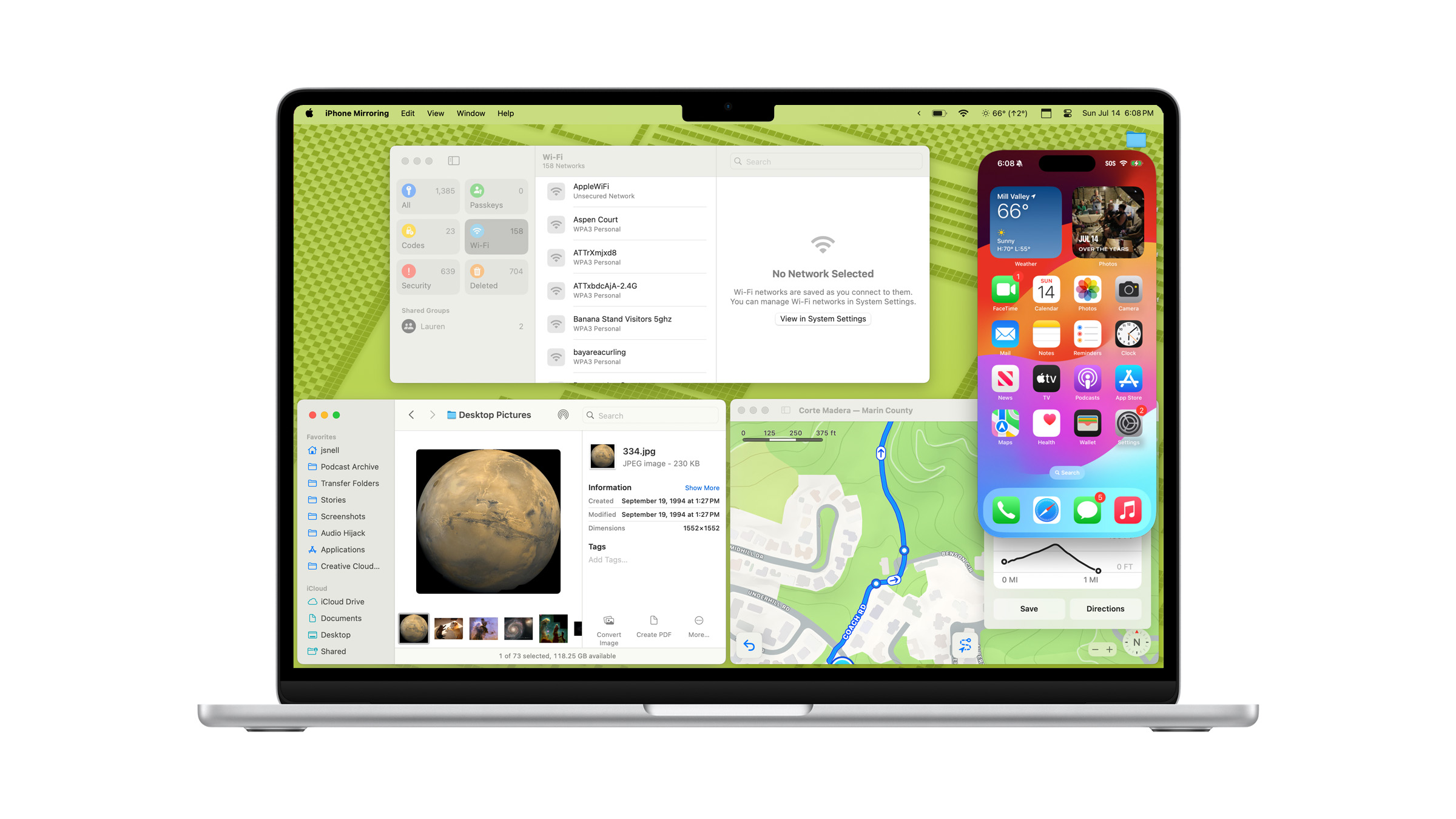
iPhone mirroring

iPhone mirroring even rotates automatically for horizontal content—but won’t let you rotate it yourself.

Every so often, Apple comes out with a new operating system feature that takes me completely by surprise. So it is with iPhone Mirroring, a new app that lets you view and operate your iPhone from the comfort of your Mac.

This is one of Apple’s Continuity features, which means that in order to connect to your iPhone, it needs to be within Bluetooth range of your Mac. Once the connection is established, I’m led to believe that the rest of the conversation between the two devices happens over Wi-Fi. I work about 20 feet away from where I keep my iPhone docked, and I was able to connect and use the iPhone without any problem.

When you’re connected to the iPhone, you see its interface on your Mac’s screen—but the iPhone screen itself remains locked, either at the Lock Screen or in StandBy mode. (If you try to take over an open iPhone, it won’t let you. And when you go back to your iPhone after a sharing session, your iPhone will alert you to the fact that it was being remotely operated, as a precaution.)

When you connect, the Mac’s keyboard and trackpad are interpreted just as you would expect, right down to swipes and scrolling. Requests for authentication can be handled by Touch ID on the Mac. When you move the pointer over the top of the iPhone Mirroring window, a window frame appears, giving you standard Mac window controls (you can minimize the app to the Dock, for instance) as well as two buttons to bring up the App Switcher or go to the Home Screen.

The screen appears flawless, operating at high frame rates and even transmitting audio back to the Mac. I was able to click around and play games as if I were running the apps right on my Mac.

The feature that will make iPhone Mirroring the most useful on the Mac is the ability for notifications from the connected iPhone (which appear in Control Center) to launch their respective iPhone apps when you click on them. I was able to react to push notifications sent from iPhone apps, via those apps, all while staying in the context of my Mac. That’s a big productivity boost, says the guy who works 20 feet away from his iPhone most of the time.

That said, I did encounter some issues. Apple says that the screen will automatically rotate into horizontal orientation when an app requires it, which I found to be true, but there seems to be no way to force a rotation when you’d prefer to use an app horizontally that also works vertically. I also couldn’t seem to bring up Control Center, enter “jiggle mode” to move or remove apps or widgets. And when I was in horizontal orientation, I kind of wished I could make the window bigger—even if all it did was blow up the content from the iPhone.

Apple also says that you’ll eventually be able to drag and drop files from the Mac straight into the iPhone via iPhone Mirroring, but that’s a feature that’s not yet available in the beta.

Put windows in a corner

You can tile windows via drags, keyboard shortcuts, menu items, or straight from the green button in the title bar.

Over the years, Apple has added numerous ways to organize your windows to macOS, from Spaces to Split View to Stage Manager. In macOS Sequoia, it’s finally offering an approach similar to what Microsoft has offered on Windows for a while now: simple window tiling.

Yes, it’s a feature that’s been implemented by numerous macOS utilities over the years, and those utilities will almost certainly offer users more options and customizability than the basic functionality Apple offers. But most people don’t seek out UI-customization utilities, and adding tiling to macOS will help those people. And as usually happens, Apple’s basic implementation will eventually lead to those users seeking out a third-party app that gives them more control.

In any event, Apple’s tiling is certainly basic. You can drag a window to the top, side, or corner of the screen in order to make it quickly resize and fill that half or quarter of your display. By default, nothing happens until you drag a window and your pointer hits a boundary, at which point you’ll see a ghostly rectangle that indicates where your window will be placed. If you want to see it more quickly, you can hold down Option, which makes the ghostly rectangle appear right away (and if you like what you see, you can release your click and the window will be immediately resized, no boundary needed).

Window tile commands abound.

You can click and hold on the green “stoplight” button in the window’s title bar to choose from a few different arrangement options. There are also keyboard shortcuts that let you arrange windows in a hurry. These are bound to an item in the Windows menu called Move & Resize that offers shortcuts for many basic moves. The idea here is that you’ll build up some muscle memory about using keyboard shortcuts to send your windows left, right, up, or down.

(Unfortunately, Apple seems to have bound these commands to the Globe key, and if you don’t use an Apple keyboard you can’t access those shortcuts without third-party add-ons.)

This is all good stuff, though given that most Mac users are using laptops these days, I am not sure how many of them will find tiling to be the solution to their problems. Users with Macs attached to larger displays, however, may find it quite refreshing. I did find the dragging to corners to be a little finicky—sometimes I felt like I really need to wiggle my windows to get the tile preview to appear, especially in the corners. Hopefully that’ll be tweaked as a part of the beta process.

Videoconference boosts

Apple’s background replacement is very good. (I was outside in a camp chair when I took this screenshot.)

One of the areas of macOS that’s seen the most improvement in recent years is how the system processes video input. Rather than passing through webcam video directly to apps like Zoom and FaceTime, that video is processed by macOS, using a lot of the same techniques Apple uses to process video and still images on the iPhone.

In 2021, the Mac got support for Portrait Mode. In 2022 it was Continuity Camera, which threw iPhone-quality optics into the mix. And last year, macOS Sonoma brought a slew of layered animated effects, reaction, and presentation overlays.

This year, Apple’s added background replacement to the mix. This is a feature that you’ve seen in a million different apps, in which your background can be replaced entirely with a different image. (I use this when I’m playing D&D—for atmosphere!—or when I’m traveling and want it to look like I’m still in my home studio.)

In a way, Apple’s late to the game with this feature, but its presence means that you can replace your background in any app, not just ones with their own replacement feature. And you may well find that you’ll prefer to turn off the app’s background feature and use Apple’s instead. Apple is clearly using its very good machine-learning-based subject detection algorithm to separate you from your background.

It’s the same technique it uses for portrait mode and its clever cut-out presenter overlay feature, but background replacement does expose the flaws of this technique better than just about any other feature. Apple’s implementation is great, better than I’ve seen in any videoconferencing app, especially in good lighting. Apple supplies some background images and color gradients, but you can also add in your own.

Safari additions

Safari Viewer forces embedded video to fill the window.

Apple has expanded Safari’s Reader feature to be a lot more than just reader. When a page has more information to offer, the new Highlights icon appears at the left side of the Smart Bar, where the Reader icon has lived up to now. (To use Reader, you now need to click on Highlights and then click again on the prominent blue Show Reader button.)

Safari Highlights is still a work in progress.

Apple says the Highlights pane will be populated with useful information gleaned from the page and site you’re on, such as a summary of an article, the location of restaurants and other businesses, and even links to movies, TV shows, and music when you’re browsing relevant articles. This all is supposedly powered by Apple’s own search engine, the same tool that has powered Spotlight searches for a while now. Unfortunately, the feature seems to not be functional yet, so I have no opinions about the utility of that information.

Likewise, Reader has been updated to add a sidebar featuring a table of contents and summary. This is also a feature that’s not currently functioning, but it’s one of those areas where I am dubious about the utility of applying AI functionality. If I’m choosing to use Reader on an article, do I need a summary? Is Reader for readers, or people who don’t want to read? Is the summary in the Highlights pane not enough?

Fortunately, there is one Safari feature that I was able to try: Viewer. This is the video equivalent of Reader. Viewer identifies embedded video on a page and displays a Viewer icon in the Smart Bar that lets you expand the video to fill the entire Safari window. It’s meant as an antidote to sites that embed video but surround it with garbage and don’t let you expand the video yourself.

It’s a nice idea, and when it worked for me, I could see its appeal. It dropped out everything else on the page, provided standard macOS video controls, and even offered a quick built-in way to send the video into picture in picture mode! Unfortunately, it worked quite inconsistently. But it’s beta season. I hope it’s more consistent in the future.

Passwords becomes an app

It’s a full-features password manager, bringing in features from Settings and Keychain Access.

After several years of building a full-featured password manager inside the Settings app (not to mention the separate repository of information in the Keychain Access utility), Apple has gone all-in on building a free-standing Passwords app, and it runs nut just on the Mac, but on iOS, iPadOS, and visionOS. (You also have access to passwords on Windows via the iCloud app. It feels like one platform is missing here, somehow.)

So, the good news: the Passwords app puts Apple’s password management front and center in a way that it never was going to be when it was locked inside Settings. It’s got a nice, modern interface—think Reminders, but for passwords—and shows not just standard web logins but things like Wi-Fi passwords and rotating time-based codes and Passkeys. And since Apple lets you share passwords with other people—you can create a seemingly unlimited number of arbitrary groups and then move passwords into those groups—it’s really a full-featured option that will suffice for many users.

The Passwords app is missing some features that you might expect from using other password apps, though in most cases it’s because Apple offers a different approach to solving the same problem. Password doesn’t offer secure notes, because that’s what Notes is for. It doesn’t save credit cards, because that’s what the Wallet settings panel does. I also use 1Password to save all sorts of other information—passport numbers, software serial numbers, even SSH keys—in a sort of digital junk drawer. Should Passwords do all those things? Probably not, but I do think that there probably should be an answer for more disordered important information that’s not just “put it in a Secure Note.”

While the Passwords app existing is a very good thing, based on this first beta it’s got some work to do to become a good app. I can’t drag an item out of the list and drop it on a Shared Group to assign it to that group, which is a perfectly reasonable thing for a Mac app to allow. And when I imported my 1Password file—a couple thousand passwords that, I admit, could stand to be pruned back—the app slowed to a crawl. Deleting items would sometimes just not stick, search results appeared and disappeared, and even small tasks like deleting a few selected items generated a beach ball pointer. I sure hope these are beta growing pains, because if this performance persists to the fall, the Passwords app runs the risk being branded a dog. I’ll be keeping my eye on this one all summer and hoping for some serious improvement.

Messages finally gets me

Emoji reactions (and colored tapbacks), at long last.

Across Mac, iPhone, and iPad, Apple is upgrading Messages to let people express themselves better. That’s a good impulse, and after a false start last year (in which Apple attempted to catch up with literally every other messaging service by misguidedly repurposing its sticker functionality), the company has really delivered.

Yes, in addition to slapping a fresh coat of (color!) paint on the classic set of Tapbacks icons, Apple has finally introduced proper support for any emoji to be used as a reaction to an iMessage. When you tap back (or control-click/two-finger-click on Mac) to a message, you now get two lines of reaction options: the first contains the more colorful classics, and the second features the emojis you’ve most recently used to react. You can, of course, use the emoji picker to find the right one.

(When you react, people with older versions of Apple’s operating systems will see a new message that says something like reacted 🚡 to “HAHA”. Inelegant, but it maintains backward compatibility.)

There’s also support for per-character text formatting, so you can finally use bold and italic in messages, as well as apply animation effects to individual words instead of the entire message. Giving people a broader palette to use to express themselves is always a good choice.

There’s also one more pragmatic new feature: Send Later. You can now tell Messages to send a message at a later time. Last night I remembered, just before going to bed, that I wanted to send a few pictures of a new addition to the family to my mom. It was way past her bedtime and I didn’t want I disturb her. With the new Messages, I could’ve set that message to send in the morning when she was certain to be awake.

This appears to be a server-side feature; Apple says that if your device isn’t connected at the moment when the message is set to send, it’ll still send. Another good choice. After years of Apple seeming to take Messages and iMessage for granted, these are all welcome updates.

More new features

But that’s not all! There are even more features on the way this season:

You can plan hikes using the new topographical map feature.

Apple Maps has added trail navigation and topographic maps, across Apple’s major platforms. I was disappointed to discover that a trail near my house that’s been closed for five years still shows up in Apple’s maps. What sources is it using? Still, letting hikers plan out their hikes and navigate on trails is a great upgrade.

Notes now will let you record audio and generate a transcript of the recording, which you can display in a column alongside your notes. I feel like there’s more to be done here in terms of taking notes during a lecture or meeting and linking the comments to the transcript, but it’s a start. You can also now do math inside a note automatically, just by typing an equation followed by the equals sign.

Photos has changed dramatically on the iPhone and iPad, which is notable because it hasn’t changed at all on the Mac. There’s a new Collections section in the sidebar, which helps surface some new automatic groupings of photos. But after several years in which Apple aggressively merged the Mac and iOS Photos apps so that they were pretty close to equivalent, this year’s interface changes are entirely on iOS.

Depending on how you feel about the new Photos app interface—and it’s definitely got some issues—it might be a blessing that Apple has passed over the Mac. Also, at last, Apple’s building a proper tool for removing background clutter for images! Third-party apps have been able to perform these kinds of tasks for years, but Apple has chosen to roll that feature into Apple Intelligence (which bars older Macs). What a frustrating turn of events.

New classic Mac-inspired desktops and screenavers are gorgeous.

Desktop and Screensavers get an injection of fun with the new Macintosh screen saver and wallpaper settings, which generates dynamic, colorful artwork based on classic bitmap graphics images from old Macs. The results are gorgeous. The other day, my desktop wallpaper featured the classic System Error bomb icon and a bright green background. Chef’s kiss.

Security prompts appear to have been ramped up a bit, much to my chagrin. When I tried to launch an app that wasn’t notarized by Apple, I was unable to force it to open by right-clicking and then choosing Open, which was the old standby. Instead, I had to open the Settings app, go to the Security pane, and click through a warning dialog that the app in question was “blocked to protect your Mac.” Once I clicked Open Anyway, I could open the app—but even then, I was forced to put up with another alert, and then forced (as an administrator with full privileges!) to enter my password before the app would launch.

This is too much to ask just to launch a non-notarized app for the first time.

It turns out that the second app I tried this with didn’t require a visit to the Settings app, so that’s something. But I still had to click through a scary dialog box and then authenticate on first launch of an non-notarized app. I appreciate Apple’s attempts to get in the way of social engineering designed to convince hapless users to install malware, but my Mac belongs to me and if I want to run software not approved by Apple, that’s my business. Throwing up a warning on first launch is reasonable. Asking users with full privileges to authenticate on top of that is unreasonable. Is there anyone at Apple who cares enough about user experience to stop warning dialogs and authentication requests from running rampant? If so, they should speak up.

AI, eventually, maybe

Theoretically, Apple Intelligence is coming to macOS starting this fall, and then rolling out throughout the next year. None of those features appear in the betas I used, though—it sounds like a late summer/early fall thing, if that. Improved Siri and some new AI-powered writing tools as well as the new Image Playgrounds image-generation tools are all on the agenda, at some point. There’s no way to tell what sort of state they’ll be in when they ship, so I’ll withhold all judgment until then. Other than to say that if the new Photos Clean Up feature and AI-driven Memory Movies aren’t on the Mac for some reason, I’m going to riot.

Beta advice

The usual advice applies: Don’t install macOS Public Betas on Macs you absolutely rely on to get your work done. If you do want to take the plunge, make sure mission-critical apps are compatible. Keep a backup. Consider installing on an external drive instead of your main boot drive. These are all smart strategies.

Thus far, I’ve found the Sequoia beta to be pretty stable. It even works with some of my mission-critical software that previously proved resistant to beta testing, which is exciting. Still, I’ve been using it on a laptop that’s not my main computer—and I don’t regret that one bit. Be wary, be prepared, and have fun out there, kids.


By Dan Moren

First Look: iOS 18 Public Beta

iOS 18 Home screens
Six takes on one Home Screen: eat your heart out, Andy Warhol.

Ultimately the reaction to 18’s initial public beta may be more about what’s not there than what is. When Apple first announced its latest annual update to the mobile software platform back in June, most of the attention went to a suite of features—the top-billed ones if you look at the company’s iOS 18 Preview Page—collected under the aegis of Apple Intelligence. These marked the company’s much anticipated foray into artificial intelligence and promise everything from image generation to a reinvigorated Siri.

But those features are planned to roll out over the course of iOS 18’s lifetime, which, according to some reports, means that many won’t be arriving until this fall or even next year. That even applies to other features not explicitly called out as Apple Intelligence, including the new Mail categorization and summaries, the ability to remove unwanted people or objects in photos, and summarization features in Safari.

While those features—or their lack—might overshadow some of the other announcements in iOS 18, when you strip them away, you’re still left with a nice—if not mind-blowing—set of updates, including deeper home screen customization, new capabilities in Messages, and a significant overhaul to the Photos app. There’s plenty to kick the tires on here, so let’s dive in, albeit with the caveat that since many of those marquee features are missing, we can’t really speak to them at all. And as usual, this is a public beta, so with apologies to Paul Thomas Anderson, there will be bugs. But that’s just part of the deal.

Your home screen is your castle

In recent years, Apple has gradually released its grip on the iPhone’s monolithic look and feel, allowing an increasing number of choices for those who want to customize their devices: widgets, the App Library, lock screen options, and so on. That trend is alive and well in iOS 18, which adds a couple new features for those who want to tweak the appearance of their iPhones.

iOS 18 Home screen with icons on vertical
I’m not sure that I’d want to do this, but now I can.

The first is to put apps “anywhere” you want on the home screen. I say “anywhere” because your icons are still constrained to the same grid that they’ve snapped to since you’ve been able to reorganize apps—don’t start getting visions of piles of documents on a Mac desktop. But you can now leave open spaces in that grid if you want things just so. I struggled a little bit with this feature, as it still wants to reflow all your apps to fit, and that can lead to difficulty getting the precise open space you want—I had much better results starting with a new, blank home screen than trying to rearrange my current chockful one.

More radically, Apple has now taken the step of adding different color “themes” to your icons. Yeah, those quotes are still hanging around, because unlike the broad customization options you might get from a third-party app like Widgetsmith, Apple’s are limited to a few options, including light and dark versions, small and large (the large forego the labels beneath the app icons for a really wild aesthetic look), and yes, the ability to tint your icons any color you like.

I have found myself enjoying dark mode icons, especially the ability to shift automatically between light and dark with the system appearance. But though I’ve played around with the tinting option, I have to say that I haven’t find a color option that I love so much that I want everything tinted that way. Perhaps this is a deficiency in my own tastes: I like the way certain icons or widgets look, but picking what felt like a fun green to my eyes made my phone look like I’d stolen it from The Riddler1. It’d be nice if you could be a little more granular about which icons got tinted and how, but I also understand the complexity inherent in that decision.

Matters may improve somewhat if third party developers buy in by tweaking their app icons to be more tint-friendly—and I’d say the same for the dark mode, though I do appreciate that Apple is doing some clever work to enable it even for those apps that haven’t specifically made one—but I’m skeptical that picking an arbitrary color is for me. Then again, perhaps I’m simply mired in seventeen years of iPhone usage!

Actually, my favorite new customization feature in iOS 18 is kind of a small one: on the lock screen, there’s now an option to set the clock to a rainbow color. It’s a nice way to add a splash of color to your phone, even when the Always On display is in its dimmed setting.

You’re in control

iOS 18's Control Center
Control, control—you must learn control!

We’ve gotten the ability to customize our home screens and lock screens in previous years, so this year Apple has ventured into new territory: Control Center. What started life as a way to quickly access certain phone functions has now morphed into a multipage affair that you can tweak to your liking. That includes not only being able to add or remove controls of your choosing, but also place them where you want and even (in some cases) choose what size they are. Plus it adds a ton of new controls and even unlocks the ability for third-party apps to provide their own actions. If that’s not enough, you can even swipe out the flashlight and Camera controls on the lock screen if you want, and iPhone 15 Pro/Pro Max users can choose to trigger a specific controls via the Action button.

This kind of flexibility is extremely welcome, though I feel like it will take some time for me to rework my memory—both mental and muscle—to get the most out of the feature. I’m so used to where the controls have been (in many cases, for years) that it will probably take time to get used to my newfound freedom. That goes double for the Lock Screen: I still haven’t figured out what else I’d even want there now that I have the option!

Of the added abilities, one that I find especially handy is that I can now have a home widget for a specific device, rather than relying on HomeKit to figure out which I might want access to at any given moment. I also appreciate Apple’s concession to the sometimes frustrating nature of having multiple pages of controls: by not lifting your finger as you swipe down from the top of the screen, you’ll continue on through the various screens until you get to the one you want.

There are still some limitations, of course. For one, there isn’t quite the same freedom to arrange controls as there is on the new home screen—no leaving open spaces here. Also, while you can resize widgets, most of them have only two or three possible sizes at max, and it’s sometimes tricky to figure out what’s actually possible—the key is to watch and see if the widget’s appearance morphs while you’re resizing it. The Action button configuration is also only limited to certain controls. And as with most features requiring third-party buy-in, it’ll be interesting to see just how much this ends up being something that developers adopt.

One other nice tidbit from the new Control Center: there’s now a dedicated power button in the top right corner, which lets you quickly shut down the phone without having to remember which button to press and hold (which is also an accessibility affordance for those who have trouble with that kind of motion).

Get the message?

Messages continues to get a lot of love from Apple—no surprise, as it’s probably one of the most used apps on the platform (in the U.S., at least). This year brings a slew of improvements, from under-the-hood protocols to flashy new effects to the ability to send a message from, well, pretty much anywhere.

iOS 18 Tapbacks
I can already tell I’m going to get a lot of mileage out of the new tapbacks.

I’m going to start by celebrating the best new improvement in Messages, the one that took us a surprising amount of time but was ultimately worth the wait: sending any emoji as a Tapback. I’ve wanted that feature almost since the moment Apple introduced the ability to react to a message, and I’m glad to say that it works just as well as I’d hoped. Apple even tweaked the existing tapbacks by adding more splashes of color as well as adding a second selection of half a dozen of your most recent emojis (on a per-chat basis) when you swipe to the left.

Text effects in Message on iOS 18
Messages now has not only simple text styling like bold, italics, and underline, but animated effects that feel like something out of Keynote.

By comparison, I haven’t spent as much time with Messages’s new text effects, which include both styled text (bold, italics, underline), as well as animations where your words—or even just a specific word—shake, ripple, explode, or more. Like message effects before them, these features try to ride that line between fun and annoying, and I think mostly succeed, though the true test of time is whether people end up using them.

Scheduling a message on iOS 18
Scheduling a message is straightforward and works pretty well.

On the utilitarian end of the scale, Apple’s added a couple new features, such as the ability to queue up a message to send later. You access that in the same strange pop-up menu as stickers, Check In, and the rest of those forlorn iMessage apps, at which point you get a little blue bar at the top of the message that you can tap to pick a date and time to deliver the message. From my tests, it seems relatively precise—within twenty seconds or so of your scheduled time—although I did discover that you can only schedule a text up to two weeks in advance. It also doesn’t have to be limited to text—you can include an image or a GIF from iMessage’s #images tool or even a message effect for those times you want to prep some birthday balloons.

However, let it be known that all of these capabilities are still tied exclusively to iMessage—this despite the fact that Apple has made improvements to the experience of texting those not on its platforms with the addition of Rich Communication Services (RCS).

Sending an RCS message with iOS 18
The RCS descriptor is so subtle, you might not even notice it.

RCS is the successor to SMS, and while it improves on some of that very old technology‘s limitations, these are more on par with Steve Jobs’s “glass of ice water to someone in hell” than to any sort of parity. It has a few notable—and welcome—advantages, including message delivery and read receipts, typing indicators, better image and video quality, and the ability to send over a data network instead of the classic cellular phone system. Plus, yes, the end of those dreaded “reacted with” messages, even in your group chats. It’s worth noting that RCS uses the same old green bubbles as SMS; the only indicator to tell you which you’re using is in the text field, which now appends RCS or SMS to “Text Message” when the field’s empty.

Then there’s the class of feature that just feels like Apple showing off. The company first rolled out its Emergency Satellite SOS feature back in 2022 with the iPhone 14 line, but why should we have to wait to use a cool feature until an unfortunate emergency? As of iOS 18, any capable iPhone can now send text messages via satellite when you’re out of Wi-Fi and cell range. That comes complete with a new animation in the Dynamic Island that helps you make and maintain the satellite connection by telling you which way you need to point your phone. (While I didn’t get a chance to try this out for real, there’s a Demo mode that you can use to at least get the experience, but you really need to have no cell or Wi-Fi signals to use feature.) Satellite texts work for iMessage and SMS—but not RCS, as Apple says that the packet sizes are too large.

I don’t think most people need this feature, but there’s no denying it’s cool. I’ve gone on occasional hikes with no cell service available, and if nothing else, it gives peace of mind that I can stay in touch with people—even if it’s not to tell them that I need to be rescued from an ill-advised walk in the woods.

Apple has said that its satellite services will be available free for two years after activation of a iPhone 14 or 15 model; those first two-year periods start expiring this fall, so we’ll have to wait and see exactly what it will cost—or if Apple will kick the can down the road so as to avoid looking like their life-saving features are only available to those who pony up.

Photos go off the grid

iOS 18's Photos app

What would an iOS update be without a big (and potentially contentious) app redesign? This year, that mantle is bestowed upon Photos, which has gotten a stem-to-stern overhaul that offers a lot more power and customization, while also forcing most users to relearn some aspects of an app that’s remained largely unchanged for several years.

I think you can best sum up this approach with the old aphorism about pleasing some of the people all of the time. Used to be we all had the same Photos app, and while there might have been some people who felt just fine about it, it ultimately didn’t matter, because there was only one experience.

Now everybody can tweak the Photos app, customizing which sections appear in what order, which is bound to make some people happier. But as with Apple’s home screen customization options, it only works up to a certain point, so those people who were perfectly fine with how the old app worked might find themselves feeling a bit at sea in the new world order.

Gone is the bottom toolbar with its Library, For You, Albums, and Search options. In its place is a new combined view: your grid of photos at the top in what Apple has dubbed “the carousel”2, and a modular set of items—”collections”—below. The carousel can be swiped through to show different sections that you choose or, if you swipe down on the library grid, it turns into the classic library view, with controls for filtering and sorting.

The modular collections below can be arranged or hidden as you see fit, although there are some limits to the granularity: for example, there’s a Shared Albums section that you can put there, but you can’t select a single shared album. (You can, however, put a single Shared Album in the Pinned Collections item at the bottom…confused yet?)

After several weeks of using the new Photos app, I’m still not totally sure how I feel about it. Newness seems to pervade every corner: when you’re viewing an individual photo or video, the old toolbars have been replaced with redesigned ones; in some cases—screenshots and video—the image itself no longer reaches to the edges of the screen, instead hovering against a white background until you tap on it. There’s also for the first time an option to toggle the appearance of the screen when you’re editing a photo—it was previously always against a black background, regardless of whether you were in Light or Dark system appearance, but now you can choose to have it be always light, always dark, or follow the system appearance.

So much of the experience of Photos is different…but I keep wonder if it’s better. Hard to say—there are a lot of trade-offs. For example, I’m not thrilled that it takes more steps for me to toggle between my Personal and Shared Libraries (I now have to tap on my icon on the top right corner, then scroll down, then select the other library, then exit out)—it seems like that toggle should be accessible from the filtering or sorting buttons. But, at the same time, I do appreciate that my icon also doubles as a sync indicator: a yellow dot appears on it where there’s unsynced content, and when it’s actively syncing, there’s a progress bar that rings your icon. That’s a feature that many folks—me included—have long wanted, and a welcome concession to Apple’s traditional approach of trying (often unsuccessfully) to make syncing transparent.

Trips in iOS 18's Photos app

Apple’s also added a few new automatic categorization features to Photos: for example, in addition to people and pets it can now recognize groups of people. I have to say that’s proved effective for me: the fact that it collects all the pictures of, say, me and my son or me and my wife is pretty great.

The other major new category is Trips. In the past these might have surfaced as Memories, but I do think there’s something to the idea of collecting pictures from your travels—I’m old enough to remember my parents digging out the slide projector to show off photos from a specific trip. If you tap through to Trips, it allows you to filter by years, but I feel like there’s a missed opportunity here from not having a map-based interface (though, to be fair, you can easily now view each trip’s photos on a map).

Apple’s goal with Photos’s auto-generated collections is clearly to reduce the dependence on searching, but just in case it doesn’t automatically surface what you’re looking for, it’s also improved Photos’s search feature, allowing more natural-language-based searches. So, for example, if I wanted to find pictures from travels with two of my friends, I can search for “trips with Jane and Evan” and I’ll get the expected results. (I’m a little surprise that’s not part of the Trips function, to be honest.)

There’s a ton more in the Photos app: filtering more types of images like QR codes and handwriting, a redesigned Activity view for Shared Albums, and a new Recent Days view, just to name a few. But trying to wade through all those new features in an app that you use every day—while also sussing out whether it’s actually making life easier or harder—is a monumental task that’s going to take a bit more time.

Additional bits

As with every year’s iOS updates, Apple has also sprinkled plenty of changes throughout the entire OS, some of which you probably won’t run into unless you go looking for them. But there are a few that I found particularly worth calling out.

Passwords has graduated from a preference pane to become a full-fledged app. While I’m hopeful that this bodes well for its future development, it’s not a seismic change. I don’t spend a lot of time in the Passwords app, because there really isn’t much reason to—most of my interaction is via the AutoFill features in Safari, which continue to work as they have for some time. I do appreciate some of the categorization filters in the Passwords app, and hope that it means we might see more types of data—secure notes, identities, etc.—in there in the future.

Calendar gets a slight redesign that makes it easier to view items, especially in the Multi-Day view. You can also pinch to zoom in the Month view, in case you need more or less detail, and fully interact with Reminders: creating them, deleting them, and so on.

Files gets some much needed control over managing cloud-based files. You can now choose to keep files downloaded or remove their downloads by tapping and holding on an item and selecting the option from the pop-up menu. (My kingdom for a way to do that with apps.)

iOS 18's Hiking Maps
Maps adds hiking directions.

Notes continues on its quest to be the everything app. Now you can have audio recordings with automatically generated transcripts, collapsible sections, or highlighted text. Even without the Apple Pencil, iOS’s version of Notes has Math Notes functionality, letting you quickly type in equations or variables and get answers. Notes can already do a lot of what Pages can do, now it’s taking shots at Numbers. Is Keynote next?

Maps goes outdoors for this update, with hiking suggestions, including the ability to make custom walking routes and view topographic maps. I hope to give this a more thorough try on an upcoming trip, but it’s a smart addition. While it gives the highest and lowest points of a hiking trail, I do wish it gave you an overall elevation change instead of making you do the math yourself. There’s also a new Saved Places interface for keeping track of locations, including guides and routes, but I still wish you could have a collaborative guide that let multiple people add to it.

The Podcasts app builds on its relatively new transcripts features to allow you to send a share link tied to a specific timecode, which is very handy for when you’re trying to tell someone about a specific moment in an episode.

iOS 18's Privacy settings

In Settings, in addition to new, more descriptive headers at the top of each section and all app settings—including Apple’s own—moved to a new sub-section, the Privacy section has gotten a substantial overhaul that makes it easier to manage. Now each separate section (Location Services, Calendars, Contacts, etc.) has a little subheading that tells you how many apps have access to that particular section. The same goes for hardware features like Bluetooth, Camera, and the Microphone. It makes it far easier to audit a specific set of permissions and make sure that only the apps you explicitly want to give permission to have it. You can also lock and hide apps from the home screen, for those moments when you might hand your phone to someone else, though it’s certainly annoying to have to do that on an app by app basis—it’d be nice if there were a unified “guest mode”, à la the Vision Pro.

There’s also at long last the ability to have a Bilingual Keyboard, which you can configure in Settings > General > Keyboard > Keyboards. If you frequently switch between languages or just, like me, get frustrated when you want to type a sentence or word in another language only to have autocorrect “fix” it, then you can now select two (but only two) languages. This is then denoted with an overlay on your spacebar, just in case you wonder why some of your English words are being changed to French.

All of this only scratches the surface of what’s in iOS 18, and more improvements are sure to be added (or come to light) as the beta process continues. Perhaps more than any update past, that progress will keep rolling along even once the initial iOS 18 release drops. Get ready for a full year of platform updates—it’s the roller coaster that never ends.


  1. And Batman Forever‘s Jim Carrey incarnation, to boot. 

[Dan Moren is the East Coast Bureau Chief of Six Colors, as well as an author, podcaster, and two-time Jeopardy! champion. You can find him on Mastodon at @dmoren@zeppelin.flights or reach him by email at dan@sixcolors.com. His next novel, the sci-fi adventure Eternity's Tomb, will be released in November 2026.]


Jason and Myke interview the writers of “What If…? An Interactive Story” for Vision Pro about the challenges of writing something that’s not quite a movie and not quite a video game for a brand-new platform. Also: hot dogs!


By John Moltz

This Week in Apple: The robots are coming

John Moltz and his conspiracy board. Art by Shafer Brown.

Phil Schiller’s schedule changes yet again, Apple sells a lot of Macs, and I, for one, welcome our robot overlords.

Or not

Remember a long time ago (last week) when Phil Schiller was set to join the board of OpenAI? Yeah, forget that. Not happening.

“Apple Drops OpenAI Board Observer Role Amid Regulatory Scrutiny”

Well, you’re not going to sit around this house doing nothing all summer, mister!

Lest you think that Schiller now has a free day again every quarter, he will instead attend regular “key strategic partner” meetings with OpenAI. So, essentially it’s the same thing, he just doesn’t get to update his LinkedIn profile.

Not only has Apple given up its “observer” seat (I think it would have worked like the Watcher in “What If…?”; Schiller could only have watched but not interfered) but Microsoft has as well. Considering Apple paid nothing for the seat at the table it’s not taking and Microsoft paid $13 billion, it seems like one company got the better deal.

Not a guarantee

Remember Macs? It turns out Apple still makes them. And a lot of them. According to Canalys, Apple’s Mac shipments went up by 6 percent in the second quarter, outpacing the PC market as a whole.

While the Mac is doing well, AI is expected to drive future sales of Windows-based computers because… uh… I guess people can’t wait for AI features like having screenshots of their passwords and financial account numbers stored in a database that’s fairly easy to hack. I honestly don’t know why analysts say the things they say.

I do love analyst projections, though, because it gives me yet another chance to link to the best analyst projection of all time. In May of 2011, an analyst for Pyramid Research said sales of Windows Phone would overtake Android in 2013. I don’t know if you were aware, but that did not happen. In fact, it did not happen times infinity. Android continued its ascendence through the 2010s and Windows Phone was discontinued in 2015. And Pyramid Research has apparently since gone out of business. So, when you read that analysts are predicting something, just do what I do: look up into the sky, smile, and fondly remember the best prediction of all time, ever.

That’s how you get a robot apocalypse

The Apple rumor mill took a wild turn this week as Mark Gurman said Apple was working on a table-top robot. Gurman did not give the robot a name but let’s assume for the purposes of this column its name is DEATH MACHINE 4000. Again, this may or may not be the actual shipping name, we will just use it as a placeholder until we hear what the actual name of this product is.

According to Gurman, the DEATH MACHINE 4000 will include a Center Stage-like feature where it is able to follow a speaker as they move around a room in order to keep them in frame for FaceTime calls. Further, it will be able to detect when a caller nods and nod up and down itself, because that’s not weird, you’re weird.

But wait, don’t throw down your money yet. Another rumor indicates that Apple is still working on a HomePod with a touchscreen display.

“tvOS 18 Hints at HomePod With Touchscreen Display”

It’s not clear if this would be the same product as the DEATH MACHINE 4000 or if Apple is simply hoping to take over your entire kitchen counter. I don’t know what your kitchen counter is like but that’s not going to work so well in my house unless the DEATH MACHINE 4000 is also a blender or an air fryer because we are at maximum counter capacity.

I’m all for Apple moving more into home automation. AI is less exciting than devices that can actually make your life easier. You know, as long as they don’t kill us.

[John Moltz is a Six Colors contributor. You can find him on Mastodon at Mastodon.social/@moltz and he sells items with references you might get on Cotton Bureau.]


By Joe Rosensteel

My prescription for Apple: Hire some ombudspeople

Apple touts a lot of things—vertical integration, interface design, the longevity of its hardware, the direct-to-consumer retail experience, and more—as part of the reason for its success. But there’s a fractured, bureaucratic, resource-constrained version of Apple, and it’s one we’ve been seeing more and more often. One Apple-designed app will do things their way, another app or piece of hardware will be stranded for years, bug reports disappear into an uncaring void, settings and warning dialogs get out of hand, notification spam goes out of control… the list goes on.

The people with the power to move mountains and get things done are at the top, but if a matter doesn’t arise to their attention—either by being something they’ve personally experienced, or were told about by a similarly influential person—then the matter is more likely than not to remain unresolved.

We need some people who can manage from the bottom up. Who can talk to developers directly about App Store issues. Whose responsibilities are the interrelated aspects of customer experience, not just the UX of a single product.

Decades ago, Apple changed its relationship with the community with Apple Evangelists. Maybe it’s time to do so again with a team of Apple Ombudspeople?

Ombudsdev

Apple’s behavior is frequently all over the place, contradictory and confused. It needs someone to smooth all this stuff out before it becomes a problem.

Take Apple’s recent back and forth with Epic Games in the EU: Epic applied to have a developer account and create an app marketplace in the EU, and were granted that. Then an executive found out about it and killed it. But then, after some saber rattling by European regulators, Apple had to reverse course. (Chapter two, ongoing: Some ridiculous stuff about button design.) Sure, Tim Sweeney and Epic have had a contentious relationship with Apple and some Apple pundits feel like it’s worth punishing them, but it really isn’t. Apple risks further regulatory action because of poor decision-making that is going unchallenged inside the company.

AltStore developer Riley Testut—who I think we can all agree has been a peach during the entire process of setting up his marketplace in the EU—faced a protracted review process. Meanwhile, Apple cooked up new App Store policies to permit “retro game console emulators,” presumably to diminish the launch of Testut’s Delta emulator on AltStore. Resilient Riley launched it in the App Store and AltStore. Then Apple just rejected an update to his emulator in the App Store because of the whims of App Review. This will surely be reversed, eventually, but why did it happen to begin with?

Where is the person inside of Apple who can look out for someone like Riley Testut and institute policies that prevent it from happening? Will anyone inside Apple ever define why a retro game console emulator is different from a retro computer emulator, and communicate it? Who can push inside Apple to keep the notarization system from being abused, and prevent Apple from coming across as a whimsical tyrant?

It’s called self-regulation, which is the best and safest kind of regulation, because it reduces the number of times Apple must spar with governments, the press, and its own developers.

Cross-device cross-purposes

Apple famously isn’t aligned around product lines, which is part of the whole “secret sauce” of Apple product development. Except it sometimes seems that nobody is asking the big questions about how Apple’s products interoperate. Do Apple products need their own internal ombudspeople?

Take Siri, which is due for big changes later this year, or maybe sometime next year. In some devices, anyway. What happens when you ask Siri to do something on this device? That one? What improvements will be made to the current Siri that’s going to still be in use for years and years to come?

This question can go to the heart of the user experience, and reflect Apple design decisions in unexpected ways. Sometimes there are dramatic issues with syncing data between Apple devices, and then other times there are the everyday inconveniences. Apple Intelligence relies on personal information compiled in the new semantic index, but (for example) Spotlight can’t index files that aren’t stored locally. Apple recommends people let macOS manage what files are on their Mac, but the potential side effect is that your Mac’s AI features will be cursed with swiss cheese memory if you follow Apple’s instructions.

Who is clearing their throat in the conference room and making sure everyone’s on the same page? And are they able to convey these decisions to the side of Apple that’s determining the base amount of storage space available on next year’s laptops?

Who supplies the balance?

It’s easy to look at some of Apple’s interface decisions on the Mac in the last few years and imagine that the teams that focus on security and privacy have run roughshod over everyone who cares about providing good user experience.

It’s not the job of the security boffins to worry about balancing security with user experience. They’re thinking about making sure the user is safe, and that’s a fine role. But it has to be counterbalanced by larger considerations, and it’s hard to imagine that anyone is empowered to do that right now. If nobody’s got that kind of clout, maybe there’s room for an ombusperson who is empowered to pushing back on onerous features that train people to thoughtlessly approve or dismiss security warnings, thereby making things less secure.

Theoretically, executives should be concerned with these things—but I suspect they lack the bottom-up perspective required.

This ‘buds for you

Everything is complicated, which is why it helps to have people inside Apple who are empowered to think critically1 about the overall Apple product experience. High overall Customer Satisfaction scores are great, but they don’t exactly find the pain points—nor does an iPhone survey root out a frustration with something on the Apple TV. And it’s easy to miss larger trends over time.

It’s a bitter pill to swallow to have an employee of your company point out all the ways something falls short when they don’t put in the time to work on it. But if that bitter pill is good medicine and it makes you better, you swallow the pill.

I guess I’m the doctor in this metaphor. Here’s my prescription, Apple: You need more people on the inside who can see the big picture and intervene before critical mistakes are made. The more the better.


  1. The actual definition of critical, not the common usage of it as a negative. 

[Joe Rosensteel is a VFX artist and writer based in Los Angeles.]


Vulture’s Josef Adalian returns to discuss the ramifications of the sale of Paramount, and where the company might go next. We also once again consider that classic streaming question—to binge or not to binge?


Travel prep, HomePod dreams, and making it personal

As we prepare for our (separate) trips to Scotland, we discuss the future price and features of a HomePod with a screen, Apple’s EU contretemps, and the value of the give-and-take between designers and engineers.


Apple to enable third party NFC payments in the EU

European Commission Executive Vice-President Margrethe Vestager has announced that Apple has committed to allowing third-party payment apps use the same NFC features as Apple Pay in Europe. This is the end result of an investigation launched by the body back in 2020, and, according to the release, has been the result of a back and forth between the EC, Apple, and interested third parties. The decision also has implications under the Digital Markets Act; the EC describes the solution as “more than what is required by the DMA.”

There are three major implications to this change: first, a secure payment method called “host card emulation mode.” This doesn’t seem to use the iPhone’s Secure Enclave, but the EC has accepted it as an equivalent solution. Second, the ability launch any payment app with a double-click of the iPhone’s side button, which currently launches the Wallet app. And third, the ability to set a default payment option.

This strikes me as a solid compromise. The EC did not, notably, mandate that Apple open the Secure Enclave aspect of Apple Pay to third parties, which might have been not only technically difficult (if not impossible), but could have potentially created other security risks. Perhaps most importantly, it illustrates that it is indeed possible for these two entities to come to a decision that is acceptable to both parties.

More to the point, the end result is ultimately good for users. If they want to stick with Apple’s Wallet app, nothing changes for them. If they prefer an alternative, they now have the option to use that seamlessly—just as, for example, iOS 18 will allow users to replace the Camera shortcut on the iPhone’s lock screen with a third-party camera app, if they prefer.

The changes will kick in as of July 25th and are to remain in place for ten years, which will be monitored by a trustee along with a mechanism for resolving disputes and independent review.


Accessing inflight Wi-Fi for free via your air miles account’s “name” field

I don’t know what to say about this other than that it is technological insanity in the absolute best way.

This meant that on my next flight I could technically have full access to the internet, via my airmiles account. Depending on network conditions on the plane I might be able to hit speeds of several bytes per second.

DISCLAIMER: you obviously shouldn’t actually do any of this

Software engineer Robert Heaton essentially built a way to access the internet by updating the “name” field on his air miles account, which could be done without actually paying for the Wi-Fi. A home computer reads the updated “name”, fetches the relevant request, and returns it…also via the name field. It’s unquestionably the least efficient way to have internet access in flight, or, as he puts it “You will now almost certainly pay for wi-fi, because your curiosity has been satisfied and your time on this earth is very short.”


Our interest in the new Amazon Echo Spot, our current charging setup and thoughts on Nomad’s new 65W GaN charger, thoughts on a HomePod with a display, and which dead property we’d like to see AI revive from any medium.


By Dan Moren for Macworld

Apple’s next-gen HomePod could change everything we know about Siri

At this year’s Worldwide Developers Conference, Apple gave a little bit of time to its major platforms: iOS, iPadOS, macOS, watchOS—even tvOS got some love. But one device was conspicuously absent: the HomePod.

Given that Apple spent a lot of time during its keynote talking about the future of Siri, one might be mistaken for thinking that the HomePod, with its reliance on Siri, would be at the center of such as strategy. But instead, it’s looking increasingly like Apple’s smart speakers will be left on the periphery as those developments roll out, or at the very least will be forced to find a workaround in order to stay relevant.

And yet, it seems like there might be something else brewing in the HomePod arena, something that moves the category forward instead of merely consigning it to an also-ran position. Something to keep your eyes on.

Continue reading on Macworld ↦


Apple no longer taking OpenAI board seat

Camilla Hodgson and George Hammond, writing at the Financial Times (paywalled):

Apple had also been expected to take an observer role on OpenAI’s board as part of a deal to integrate ChatGPT into the iPhone maker’s devices, but would not do so, according to a person with direct knowledge of the matter. Apple declined to comment.

Microsoft, which has held a non-voting board seat since the Sam Altman fiasco last year, has also given up its position. Instead, both companies will be part of “regular meetings with partners”, along with some of OpenAI’s major investors. This seems to be, at least in some part, due to increased scrutiny related to antitrust concerns in both the European Union and U.S. Given that Apple and Microsoft have been subject to plenty of antitrust attention, especially in the EU, it’s reasonable they wouldn’t want to open themselves to more.

But this does make for a wild ride for Apple. It was just a few days ago that it was reported that Apple Fellow Phil Schiller would be taking the observer role as part of the company’s deal with OpenAI, but I guess Phil can go back to sparring with Epic in Europe full time.


by Jason Snell

TUAW returns as a gross, zombie AI-generated garbage site

Via Christina Warren, some jokers called Web Orange Limited have acquired The Unofficial Apple Weblog—a classic player in Apple blogging—and have turned it into a gross AI-generated garbage blog posting as a real one:

The Unofficial Apple Weblog (TUAW) has been a cornerstone of Apple-related journalism since its establishment on December 5, 2004. Acquired by Web Orange Limited from Yahoo IP Holdings LLC in 2024 without its original content, our mission has been rejuvenated to continue providing Apple enthusiasts and tech professionals with authoritative and engaging content. We strive to serve as a comprehensive resource for news, credible rumors, and instructional content that spans the Apple ecosystem and beyond.

The tell? They’ve re-used the names of key historic contributors, but generated new bios and photos(!) and claim that new stories are written by these historic contributors.

I looked up my friend Scott McNulty, a laughable 360-word “deep dive” that references Mac OS X Jaguar and Tiger. It’s dated July 1, 2024. The bio bears no resemblance to reality, and the dude in the photo is not Scott McNulty. The very least these crooks could’ve done is give Scott a hot author photo, but no.

Anyway: Don’t go to TUAW.com. It’s a scam.

(Update: After coverage here and elsewhere, the site has changed all the names of real people to fake people. Same bios, same photos, but now fake names. This doesn’t stop the new TUAW from being an AI-generated garbage farm, but at least my friends’ names aren’t attached to the garbage anymore.)


by Jason Snell

Apple outpaces global PC growth

Analyst Canalys has updated its worldwide PC market share stats, and while the PC industry actually showed 3.4% growth year-on-year, Apple’s sales grew 6% during that period:

Apple secured the fourth position, shipping 5.5 million units and capturing a 9% market share, marking a 6% increase compared to the same period last year.

Mac market share is now 9% (okay, 8.8%, but who’s counting?) which seems small but historically is a pretty healthy number for Apple. And of course it doesn’t factor in revenue or profit, two areas where Apple generally out does the competition.

Apple has been outpacing the PC market for years now, but with the overall market now growing and the possibility of a sales spurt due to the introduction of Copilot Plus PCs, it’ll be interesting to see how Apple fares overall.

Speaking of figures (since Canalys’s are unofficial, of course), one other Apple-related note: Apple will announce its official results for its most recent quarter on August 1, so get ready for some colorful charts to kick off August.

[Via Ben Lovejoy at 9to5Mac.]


There’s more news about Apple’s battles with Epic and the EU, and Apple tightens its ties with OpenAI, but all of the controversy gets us thinking about what makes us stay excited about technology during difficult times.


By Jason Snell

I’ll have my AI email your AI

There’s a joke in one of my favorite movies, “Real Genius,” which feels directly applicable to a lot of AI discussions we’re having today. (It’s an ’80s movie, so it’s not a scene—it’s a montage, set to “I’m Falling” by The Comsat Angels.)

In it, our protagonist Mitch attends a normal math lecture, but over the course of the montage most of the class is replaced by tape recorders of various sizes.1 In the final shot, Mitch enters the lecture hall to discover that a large reel-to-reel tape player has replaced the professor himself. It’s just one tape recording being played into all the other tape recorders.

One of the announced features for Apple Intelligence, Smart Reply, will offer quick ways to respond to direct queries in email, asking you simple questions (“Do you like me? Check yes or no.”) and drafting a reply for you.

Apple is hardly the first company to suggest that in the future, your phone will write your emails for you. Gmail’s Smart Compose has been doing it for several years, and Apple’s been offering its own version of multi-word autocomplete for almost a year.

But with this latest round of AI announcements, once again, I’ve heard a lot of people making jokes about how, pretty soon, your AI will email my AI, and humans will never need to be involved anymore! It’s usually meant as absurdity, but I think there might be more to it than that.

Suppose our AIs end up emailing each other endlessly, striking up meaningless conversations and having their own inner lives. In that case, that might make for an interesting science fiction story, but I’m not sure it would really matter to us as humans. Think of it this way: email is just a communication pathway. It was built for humans to talk to each other, but for years now, we’ve received automated emails, newsletters, spam, and the rest.

If you know much about tech, you’ve heard of APIs, or Application Programming Interfaces. APIs are, at their most abstract level, an agreed-upon method for software to use or communicate with other software. APIs are in the cloud, on the web, on our devices, everywhere. So why not in our email messages, too?

I realize that it’s absurd to consider that a free-form email message would ever be better than a programmed API, but email has a flexibility that other APIs don’t. Emails can be about literally anything. And a lot of times, APIs are just not well used because the people who would use them are lazy, busy, uninterested, or don’t know they exist.

Let’s say you need to find a common meeting time for you and four other people. Are there internet calendar APIs for this? Yes! Are there calendar apps that feature built-in support this sort of scheduling? Yes! Are there literally web apps that will do this work for you? Yes! (I use StrawPoll, myself.) And yet, I’d bet that most people just… send an email to everyone asking them if they can make a certain time and try again until they get it right. It’s not efficient, but it is convenient.

Now imagine that same scenario, but everyone is using an AI system that’s reading email and has access to each user’s calendar. The end result might be the same as using an existing API or web app, but instead email messages among AIs are sorting it out. Maybe some AIs know exactly when their person is available; others might need to ask. But instead of the onus being on the users to interface with other systems and bring it all together, the AIs handle most of it and the user just chimes in when it’s necessary.

I don’t think that’s an absurd scenario. (And yeah, if the AIs are particularly intelligent, maybe they’ll use an existing calendar service to solve the problem up front.) It’s the equivalent of each of those people having their own human assistant setting up the meeting—except none of them likely have the budget to hire a personal assistant.

In fact, where AI assistants really run into trouble is not when they’re talking to other AIs, but when they’re talking to human beings. Remember when Google showed off its service that pretended to be a human and called real people to verify Google Maps data or make reservations? That’s what I really dread: being battered by emails and texts and phone calls from AIs operating for people and organizations who want my attention but aren’t willing to give me any of their own.

As long as I, a human, don’t have to read a pile of AI-to-AI email communications, I don’t mind if they have them. The protocol doesn’t really matter—use iMessage or RCS, for all I care—so long as the job gets done and I’m not left to clean up the mess. Keep me out of it, other than answering questions or making my own requests.

Email and text messages may be a stupid way to build an interconnected web of AI software systems, but history has frequently shown us that sometimes the easiest solution is the one that’s available, not the one that’s the most elegant.2


  1. The scene is meant to satirize the apparent mid-80s proclivity of college students to tape their lectures, or to skip their lectures and have a friend tape them? I dunno. Three years after “Real Genius” came out, I went to college and discovered that there was an official student organization that would sell you the complete lecture notes of any major class. 
  2. My university’s Lecture Notes service was eventually replaced by—you guessed it—AI

By John Moltz

This Week in Apple: More like bored meetings, amirite?

John Moltz and his conspiracy board. Art by Shafer Brown.

Phil Schiller has a new role, we get a glimpse into Apple’s fall releases, and why don’t Epic and Apple just kiss already?

Ben Stein: “Schiller? Schiller?”

Congrats to Apple fine fresh Fellow Phil Schiller for landing a cushy gig on the board of OpenAI. Even better for Schiller, he’s just auditing this class.

“Apple Poised to Get OpenAI Board Observer Role as Part of AI Pact”

As an “observer” all he has to do is show up to some Zoom meetings! He doesn’t even have to read the board books! He probably has to put a shirt on, but no one’s gonna know if he’s not wearing pants. Sweet gig.

It’s also sweet for Apple. As Dare Obasanjo notes, Microsoft had to invest $13 billion in OpenAI for the same privilege. Apple paid nothing, it just happens to have the platform OpenAI really wants to be on.

While Schiller is only supposed to only be an observer, maybe he can ask them about this:

“OpenAI’s ChatGPT Mac app was storing conversations in plain text”

Oops. Don’t worry, though. OpenAI is on it.

“We are aware of this issue and have shipped a new version of the application which encrypts these conversations,” OpenAI spokesperson Taya Christianson says in a statement to The Verge.

“Having been made aware of the situation with the cows escaping, we have closed the barn door.”

“We’re committed to providing a helpful user experience while maintaining our high security standards as our technology evolves.”

“We apply the same rigor to security that we do to respecting the copyright protections of web content creators.”

Fall previews

Fall previews are here and I hope you’re looking forward to AI because it’s coming to every iPhone 16.

“Apple Leak Confirms Four iPhone 16 Models With Same A18 Chip”

Assuming Apple has not changed its scheme for model numbers, these recently discovered new numbers indicate all this fall’s iPhones will have the same chip. If Apple has changed its numbering scheme, then chaos reigns and all bets are off.

There is also news about the upcoming revision to the Apple Watch. After a number of miscalled redesigns, the Series 10 will surely be the one to remake the Apple Wa-

“Apple Watch Series 10 may not get a radical redesign after all”

Wha… Why do we even do rumors anymore? What’s the point of anything? I give up. This is ridiculous.

[Gets up. Walks away. Is seen just out of earshot cursing and kicking dirt. Pauses. Takes deep breath. Returns to keyboard.]

OK. OK. Sorry. It’s just…

Anyway.

NCIS EU

Hey, remember that whole thing between Apple and Epic? Turns out it’s still going on. It’s like the NCIS of corporate disagreements.

“Epic Games says Apple stalling launch of its game store in Europe”

Apple? Throwing up roadblocks to Epic? Now I’ve seen everything.

According to Epic, Apple has rejected its store app, saying the labels and buttons look too much like those in the Apple App Store.

Apple? Rejecting an app because of design complaints? Now I’ve seen everything.

“Apple’s rejection is arbitrary, obstructive, and in violation of the DMA (Digital Markets Act), and we’ve shared our concerns with the European Commission,” it said.

Apple? Making arbitrary and obstructive app approval decisions? Now I’ve yeah, OK, we could do this all day, you get the point.

Apple continuesto test the waters of the DMA, possibly trying to see how far it can go before the EU starts fining the company 10 percent of global revenue. But as anyone who’s held their finger one inch away from a sibling they were specifically told not to touch while riding in the back seat of the car knows, all it takes is one bump to find out the hard way whether they meant that threat or not.

[John Moltz is a Six Colors contributor. You can find him on Mastodon at Mastodon.social/@moltz and he sells items with references you might get on Cotton Bureau.]


Siri Fragmentation and Quadratic Equations

Preparing to differentiate between Siris, a summer of betas and travel, and why we don’t do math.


Our app routines, how we feel about smart rings, the smartest other tech gadgets in our homes, and how we stay informed without spiraling into doom.


Search Six Colors